Monday 17 December 2012
Friday 14 December 2012
First cut of our music video
This is the first cut of our video. From this we will look at what needs to be amended and improve our piece.
Thursday 13 December 2012
Evaluation questions
1.In what ways does your media product use, develop or challenge forms and conventions of real media products?


A way in
which we used forms and conventions of real media products is through the use
of camera shots. In particular one of our artist looking over her shoulder and
looking straight into the camera. It is used fairly often but works so well as
the artist is directly looking at the viewer/fan. This gives a sense of femininity
through flirtiness and confidence. The nearly barely naked shoulder gives sex
appeal to the artist and makes her more appealing to the eye which is a bonus
for the artist. The fact that she can look at a camera so easily brings us back
to the pop genre as it could even mean that due to the fact they have become so
successful, she has gained her confidence through being an artist. ~Taylor
Swift uses this camera shot in 'love story' has a very similar approach she does exactly
the same, she also looks directly at the camera from over her shoulder. The
fact that she has her back in the shot also shows sex appeal which is always
important to have in the pop industry as the female pop artists generally have
this.

Another way that we used
conventions of real media products is through the use of the narrative. The
location of our music video is set in a field which strongly conforms to both
pop and country genre for different reasons. It conforms to the pop genre
because it is a fantasy place, of which she wishes to be there instead of being
in her class. It is a very normal situation for a girl to be in, to be dreaming about the one she loves as generally pop songs refer to love most of the time. In particular with the setting we liked
to use the rule of thirds and have our artist at the edges the majority of the
time to make sure that the setting is incorporated and acknowledged as it plays
a massive part in our conventions. Taylor swift uses this is her song 'i knew you
were trouble. The long shots are done purposefully as the setting plays a huge
part in knowing why she is there, and the narrative tells a story of her struggle much like our artist Adie Gentry- Falling hard.

A convention
in which Tash and I developed was the split screen method which we were able to
do on final cut express. The song 'who says' by Selena Gomez uses the split
screen effect which, when doing research about micro elements i came across and
felt like it was such a good effect and would improve any music video as it
looks so complicated and high tech, when in fact is extremely simple to do
which i found when experimenting with final cut and looking on tutorials on YouTube.
We developed the split screen even more by not only having 2 screens but in fact having 4 of the girls footsteps and various other shots of her as she is the
main focus in the video. We also included the girls crush into the split screen
by splitting the screen into 2 (one on the top left hand corner and the other
on the bottom right) to show that in the girls fantasy world she is actually
teasing the boy and almost playing hard to get. To make it even more fantasy
like, we used transition effects before and after each split screen to give a
softer shot to fade in and out. I think that this is one of the most effective
edits included in our music video as it is not greatly used in the country or
pop genre as much so it gives a new and interesting touch to the video.

Another way in which we
challenged forms and conventions of real media products is through the use of
extreme close up shots. From my knowledge of pop/country music videos there are
generally close ups of hands/ faces etc however we took this close up to
another level and used an extreme close up on our artists lips. This was
effective as not only did we read her lips but from this actually take in what she's
singing about which in this case strongly relates to love which is the main
theme of our narrative as we want to give out the message as to why she is
singing this song. Another artist that uses this but on the hands is Rihanna in
her song 'diamonds'. She uses extreme close ups on her and her lovers hand
which shows that she and the other person share a strong bond so by using close
ups actually enables you to find the meaning in a song, even if the artist isn't
actually singing.

A convention
that we challenged was the fact that we
didn't have any performance in our piece. Typically in pop/country genre they
have particular scenes in which they are playing an instrument or singing by a
microphone, however we wanted to make our video different by just having
narrative so that it would be more like a story, we almost modernised ours a little so having a chnge instead of seeing instruments all the time.
This is challenging part of Firths theory of the performance in a video being
the most important part of a music video. Shania Twains 'man i feel like a
woman' includes a the complete opposite to our music video as her video is
totally performance. We made our narrative on the other hand look realistic as we have a
natural setting and the actor and actress Mike and Abi are as natural in front
of the camera as they can be, as if the cameras aren't even there however man i
feel like a woman is completely set up and is an unrealistic setting and has a completely different meaning, as it has connotations of other songs however our narrative was our own idea and used simplet yet effective ideas for a narrative that would be easy to understand.

Finally the second way that our media product challenge conventions of real media was again from the narrative as usually its the girl chasing the boy, but we thought due to the song choice that the boy would chase the girl. I think that this has been effective as in this modern day, it is no longer just boys chasing girls but in fact a lot of girls chase boys too, so we added a modern touch to the narrative to make it seem obvious to whoever watches the video that the girl is dreaming about the boy. In Taylor Swifts song 'you belong with me' it shows a cliché scene of a girl that likes a boy and she tries to be with him however in our artist- ~Adie Gentry's dream it is in fact the opposite.

2. How effective is the combination of your main product and ancillary texts?
3.What have you learned from your audience feedback?
On our second cut of our video we added annotations on YouTube to show what feedback we received from questionnaires and other peoples opinions. This is extremely useful as it is a guide on what to change and what worked etc. We learnt a lot from this. For example we learnt that in order to make our video more of a professional and believable one, we needed to include more lip syncing, especially on the chorus parts as they particularly emphasise the reason why she has made and sung this song, so for a love story and how she feels like its going. We needed to be more aware of shots that were put in, that they had a purpose, they they had a meaning behind why they were there which we made the mistake of putting a scenery shot instead of the artist lip syncing which we found from looking at ourselves and from various comments that it didn't work. However we took all of this into consideration as without this feedback we would not have known how to improve it so it has helped us a lot.
4.How did you use media technologies in the construction and research, planning and evaluation stages?
Tuesday 11 December 2012
Ancillary texts- Completed Digipack and Advert


Monday 10 December 2012
Unused photos

With this first photo, we decided against using it because the image as wasn't the correct size, it was too big length wise even after editing it on photoshop so that it would be an appropriate size for a professionally edited digipak. Also this photo was edited too dark and i was unable revert the image back to the original one.

With this image i played around with the effects quite a lot. I thought that in order for her to be centre of attention then a good way of emphasising this was to blur the background out and as a result didn't look as good as i wanted it to be, also because the tutu she wears is very feminine so would be a suitable costume for her to wear. I also wanted to add a personal touch to it by adding the same font as we used for the front and back cover to make it all match professionally with part of the colour theme of pink.

This was our original front cover.
We thought by making the photo black and white and her in colour it would be a decent way of challenging the typical pop convention. However after careful thought we decided against this as it looked almost too fake and unrealistic that we just weren't happy with it. Also it was fairly difficult to make our particular font that we wanted, show up well in front of the black and white background, so we were having trouble with that too and had to make sure that we had to have an 'inner glow' a 'drop shadow' and an 'outer glow' to make sure that it stood as much as we could make it. Here is a print screen of how i had to make the text in the layer on photoshop as bold as i could.


This photo we considered using but by using this we thought that we would have used outdoor scenery of trees etc a little too much as we have used both photos of our artist and of just the scenery so to have the majority of inlays as scenery wouldn't be appealing to the
buyer of the album.


This last photo is very nice as we very much liked how the trees all caved in together- this photo is very clever indeed however the lighting wasn't very good as it was too bright and however much we edited it and tried to tone it down by hue, saturation, curves etc it just didn't work so we had to make so with this end result on the editing. It doesn't look totally awful but the use of the pinks yet again would be overusing the pinks and purples as much as they look good in the edited photo.
Friday 7 December 2012
Adverts
 As well as making a Digipak, we have to make an Advert too. I have done some research and i have found a number of Adverts that are useful to analyse to get an idea of how to set our Advert out.
 With this Gwen Stefani advert it is very bold. Italmost looks like the photo has been edited to look like she isnt real, and that she is animated by what looks like a watercolour effect. She is central so all of our attention will immediately be brought onto her. The crown and the other props thathave been added in are all sparkly which depicts a flashy woman, that she is very successful in what she does and how she can afford to spend money. The crown shows that she is viewed as a 'queen' of her kind of genre. The colours are very vibrant, and all the colours almost merge into eachother,especially the greens and oranges, and match extremelywell with the colour of the font. The font is very old english, very traditional which goes with the jewels to add to the royal look. In the corner there is a photo of the front cover of her digipak to advertise that too to encourage eople to buy it. The photos are very similar and the advert photo looks like a zoomed in picture which personally makes me want to see the whole thing. It includes information about when her album is due out and what songs are on there -rich girl is a very popular song so people would recognise that and encourage them to buy the rest of the album. Included on this is somewhere to purchase the album so it is quick and easy to buy.
 Taylor Swifts advert has a very different portrayal to Gwen Stefani's. She looks very innocent yet her eye contact with the camera adds a bit of sex appeal as she is looking from the corner of her eyes.Again though she is central in the advert which draws us automatically to Taylor Swift's face. The colour theme is very minimal only using yellow, red and white which matches with the photo.The font looks like it has been hand written which gives Taylor swift a personal touch to her advert, and her name looks like it has been written so could possibly be her signature and uses it to be known for this. It says where the album is available to buy so it is easily accessible for their audiences to buy it. Much like Gwen Stefani's advert it shows the front cover of the album and from what we can she see looks very glamourous in what seems to be a red dress. It has added extras written in bold near the bottom to appeal to the public even more. The QR code in the bottom right hand corner may take the audience member onto her website which is also useful.
  This advert by Jessi J is very in your face, it is very centre of attention and gives a lot of attitude with her mouth open. All of the colours work well together as her make up which is smokey and dark matches with the grey bold and capitals font that stands out. Jessi J's name is in an italic font in a silver colour, i don't think that her name stands out as much as it is a fainter colour however as jessie j is very well known for her chart songs, her name doesn't need to be very bold and stand out. Her songs that are mentioned from her new album are very successful already and especially featuring people like david guetta will definitely expand her audience and even just her name. She has an official website which is useful for her fans to look at directly for tour dates etc and for more info about her. The way she looks at the camera is very daunting which emphasises her confidence and her attitude, as, if she can play up to a camera for a photo shoot then you can imagine what she would be like live.
 Thursday 29 November 2012
Our digipak layout
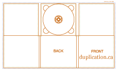
We have decided to go for an original Digipak template. We are in the process of making our digipak, using photoshop which is a challenge as Photoshop isn't a program i would normally use. We have found very useful tutorials on youtube.
Subscribe to:
Posts (Atom)